Sunday, 8 October 2017

Audience Research: Questionnaire


To form an understanding of what audiences expect from music videos, I designed a questionnaire. This questionnaire was created using the online tool Google Forms, which allows users to create surveys, distribute them and receive results immediately after completion. I found this to be more effective than had I distributed physical, paper surveys.

My questionnaire featured ten questions, taking both qualitative and quantitative data. The questions I chose were such that I felt they would aid me in targeting my production towards different groups and audiences.


To achieve a more balanced sample, I distributed my survey to people of different ages and occupations, rather than just gauging the views of people of similar ages to myself, such as my fellow media students.


The questionnaire can be seen, in full, below:

Friday, 6 October 2017

Audience Research

The song I have chosen for my music video is over 50 years old now. As such, it is unlikely that many adolescents will be familiar with both the song and the genre itself (rock/folk). However, according to a survey on SurveyMonkey.com, approximately 56% of Beatles fans are under the age of 20. Also, according to statistics from popular streaming service Spotify, 61% of Beatles' listeners are under the age of 35. These statistics suggest that the genre of music, and the artist that my song is from, are still accessible to young people, in great part thanks to the music's availability on the internet. This also means that even if those in my target demographic are not familiar with this musical style, there is still a likelihood that they will be open to listening to it, contrary to stereotypes of young people today disliking older music.

From this information, I no know that I don't have to shy away from targeting my video towards audiences in the 15-25 age range. This means that I can press on with the representation of young people in my video, and target my video towards this particular age demographic.

The survey analysed on SurveyMonkey.com also provides another telling aspect of the demographic: gender. According to the survey, 84% of Beatles' fans surveyed were male. What I can take from this is that I would not be wrong in targeting my music video more towards the male demographic, which would be represented in the video itself by a male protagonist, in accordance with the lyrics of the song, speaking to the 'nowhere man'.

Thursday, 5 October 2017

Research: Analysis of 'Novacane' by Frank Ocean


‘Novacane’ is a song taken from R&B artist Frank Ocean’s 2011 mixtape Nostalgia, ULTRA. The song’s lyrics paint a narrative in which Frank encounters a nameless woman who studies dentistry, while starring in adult films to fund her tuition fees. The woman offers Frank novocaine, a drug used to numb pain. Throughout the song, Ocean’s relationship with this woman leads him down a spiral of drug use and numbing agents from which he feels he cannot escape, and which takes control of his life. Novacane offers a dour and heart-wrenching portrayal of heavy drug-usage, and the causes behind such.

The music video for Novacane expertly combines performance with narrative to illustrate the toll that the excessive drug use has taken on Ocean’s life. Interestingly, the narrative presented in the music video is not a direct visual telling of the lyrics, but more of a follow-up from the story that Ocean tells through his lyrics. From this perspective, the music video shows Ocean retrospectively describing to the viewer, the story of how he got to this point.

The music video opens on a dark apartment interior. Through the slow-panning camera movement, a beautiful woman is revealed, seated on a chair, however she quickly dissolves into a cloud of smoke. Panning further, Frank Ocean is revealed, sitting alone in the middle of three chairs, smoke surrounding him. Ocean takes a puff of what appears to be a cannabis joint, at which point two more beautiful women materialise around him from the smoke. Consequently, Ocean’s expression also drops, displaying no emotion. This also references the song’s lyric: ‘zero emotion, muted emotion.’
This introduction is not only an impressive visual effect, but is used also as a powerful storytelling tool. Through this short visual, it is implied that Ocean loads himself with drugs for the euphoric, yet short-lived highs, despite not showing signs of actually being happy with his lifestyle. The women around him disappear once more, and Ocean then repeatedly intakes the drug to resurrect his high.

The camera movement begins to unveil more of the apartment setting, revealing a wealth of expensive decor and furniture. It is most likely that this is in-fact a hotel, and not a permanent residence, suggesting the impermanent, transitory nature of Ocean’s lifestyle. It is at this point in the video where the performance element is introduced. Ocean is found seated in front of a bed.
At this point, the use of colour in this music video should be examined. The video is graded to have a noticeably green palette. On top of this, Ocean is wearing a shirt with green patterns printed across it, and all of the smoke visualised in the video is of a green shade, also. The likely implication being made by this is that green is the colour most often associated with cannabis, and therefore, casual drug use.

The final half of the music video consists of a performance by Ocean. He sings the lyrics directly into the camera without a shade of emotion. Alongside this, his mouth is drooped down, and gradually falls lower and lower as Ocean is consumed by the drugs. Ocean then begins to rub Topicaine across his face, a form of topical novocaine. Upon doing this, Ocean is confronted once more with hallucinations of women surrounding him, joined by imagery of rainforests, panda bears and white tigers. Throughout this, Ocean presents no signs of experiencing joy or even satisfaction, and instead continues to apply the novocaine to make himself more and more numb.
Continuing to apply the topicaine, the camera stutters and Ocean’s face begins to distort in an exaggeratory fashion, becoming increasingly affected by the drug use. The frame is also now filled with hallucinatory images and smoke, to which Ocean pays no attention. The camera also moves in-and-out of focus. The frame also becomes darker, and the level of green tint steadily rises. The use of visual effects coupled with simple camera movements during this short sequence makes for powerful imagery which demonstrates Ocean’s mental state. These effects are also well-demonstrated through Ocean’s performance, as his delivery becomes more-and-more slurred with each lyric.
The level of distortion through both camera and visual effects increases to a point at which it reaches its climax. As Ocean is about to break out once more into the song’s chorus, he is slapped across the face by an unseen woman, at which point the music cuts out and the hallucinations disappear. The fact that all we see of this woman is her hand speaks to the intimacy of the music video to Ocean himself. It also suggests that Ocean is not paying attention to the woman, and she is much like another hallucination to him. This also paints a bold picture of the effects of heavy drug reliance. We, as an audience, were not aware of anyone around Ocean, or being affected by his actions, and it is suggested that he himself has not considered such. The slap, however, illustrates the frustrations of those around Ocean toward his behaviour, and represents the effects that his actions have on others, while Ocean is oblivious to this, and is totally numbed by his novocaine.
Frank Ocean is ‘snapped out of’ his hallucinations, and his image fades out, until all that is left is an image of smoke, with a green tint. We finally fade out on a dark and abrupt note, with no narrative resolution to Ocean’s struggle, seemingly finding himself in an endless cycle of drug intake and numbness.

In conclusion, the music video for Frank Ocean’s Novacane is a masterful example of how visuals can be manipulated to not only compliment a musical piece, but to extend its meaning and build on its narrative, if applicable. The video takes place in one, confined set, however use of camera, colour grading and simple visual effects paint a minimalist and painfully effective picture of how this song should be represented through the visual medium.

Tuesday, 3 October 2017

Research: Analysis of Magazine Advert for Kanye West - Late Registration

Image result for late registration advert
The magazine advert for Chicago producer/rapper Kanye West's 2005 album Late Registration aims to intrigue and engage the viewer. This is first achieved through the use of imagery. The album artwork is enlarged, and fills the entire width of the advertisement. It features West’s central mascot, dubbed the ‘dropout bear’, whom also featured on the cover for West’s first album, The College Dropout.


Placed above the dropout bear is the artist name and the album title. West’s name is stylised as KanYeWest, displayed in a gold, serif typeface, and fills almost the entire width of the advert. This effectively draws the viewer’s attention to the advertisement. In 2005, Kanye West was on the rise as an up-and-coming star in hip-hop, and many would have been familiar with his name from the success of 2004’s The College Dropout.


The album title is displayed in all lowercase, and in white lettering, so as to distinguish the album title from the artist name. Interestingly, it’s placement (below the artist name) suggests that the album title is secondary to the artist himself, a pattern found in many album adverts. This is because the artist’s profile and their brand, is, if the artist has found success, capable of selling the record on its own.


Down in the bottom quarter of the advertisement album reviews are featured. There is the use of ‘star’ ratings, which are an effective way of combining imagery and scoring to communicate an opinion. Scores are taken from reputable sources such as Uncut, Observer Music Monthly and Sunday Times Culture. Alongside these, short quotes are taken which aim to compact the magazines’ opinions. Adjectives such as ‘ENTHRALLING’ and ‘MASTERPIECE’ are employed, along with longer, more explanatory quotes, for example: ‘EVERYTHING HE TOUCHES TURNS TO GOLD’.
This quote in particular I find to be powerful, as it coincides with the use of gold shades in the text that are employed across the advertisement; in the review scores, review sources and, above all, the artist’s name at the top of the advert.


In conclusion, I view the magazine advert for Late Registration as a successful endeavor. Its minimalist construction means that all elements are focused, and viewers’ attention is drawn via the clear imagery and bold text. This is bolstered by the display of positive review scores, which reinforce to viewers, the belief that the product advertised is of high quality. This is the aim of an album advertisement, and here it is done effortlessly.

Monday, 2 October 2017

Research: Album Artwork Analysis of George Harrison - All Things Must Pass


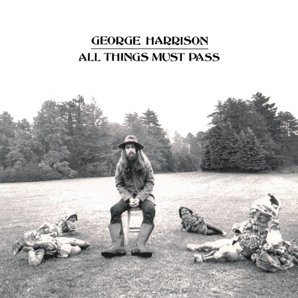
George Harrison - All Things Must Pass

The debut solo album of ex-Beatle George Harrison was released in late 1970, following the break up of the Beatles. The photographic artwork for the album is fairly minimal, however it manages to present many of Harrison's intentions following his ventures as a solo artist. At the centre of the cover, Harrison is pictured, seated on a stool above four garden gnomes. It is likely that these gnomes were utilised as representations of each of the Beatles, and that Harrison placing himself separate from them represents his attempts to differentiate himself from the group, as a solo artist. The photograph on the cover is distinctly in black-and-white. The lack of colour conveys a somewhat glum and sombre tone, which is reflected in the tone of many of the tracks on the album. This gloomy tone suggests that, despite his attempt to establish independence, Harrison still feels some sorrow regarding the recent break-up of the Beatles. This is also represented in the album's title, All Things Must Pass, which presents a sincere acceptance  on Harrison's part that all things (in this case the Beatles) must come to an end.

Sunday, 1 October 2017

Research: Album Artwork Analysis of Kanye West - Yeezus

Kanye West - Yeezus
Kanye West's polarising 2013 album 'Yeezus' became iconic in hip-hop for its album artwork, or lack thereof. The cover is minimalism at it's most extreme, comparable to The Beatles bold 1968 'White Album' cover. For it's physical release, the Yeezus CD cover consisted exclusively of a single coloured label, along with a parental advisory sticker, and no more, on a clear plastic case. This approach was in sharp contrast to West's five earlier albums, which all featured sprawling, colourful artwork on their covers. The lack of any artwork for Yeezus was symbolic of the direction of the music industry at that time. With streaming services such as Spotify and Tidal becoming increasingly popular, physical CD releases were becoming obsolete, and West acknowledged and embraced this. He described the Yeezus cover as an 'open casket to CDs'. This suggests the artwork for the album was presented as if to give audiences one last look at CD's before they essentially 'die'. Of course, many albums are still released on CD today, however the majority of music is now consumed via internet streaming services. Kanye West's next album, 2016's The Life Of Pablo was, unsurprisingly, released exclusively on streaming services without any physical release. With almost no artwork at all, Yeezus manages to present a cover that is minimal, symbolic and engaging, without the need for a traditional work of art.

Wednesday, 20 September 2017

Research: Album Artwork Analysis of Paul McCartney - RAM

Paul and Linda McCartney - RAM
Paul McCartney's second solo album was released in 1971. The artwork for the album is predominantly vivid in colour, contrasted also with a black-and-white photograph. The coloured element of the artwork is clearly done in felt-tip pen. This suggests a hand-crafted and homemade element to the album. Felt-tip pens are most-often used by children, which also reflects the childlike, family side to the album. This is also personally fitting, as Paul had two children at the time of this album's recording, and the music was made in collaboration with his wife, Linda. The other element to the artwork is a black-and-white photograph of Paul, on a farm with a sheep, in direct reference to the album's title, RAM. The lack of colour in the photograph contrasts the bright patterns on the rest of the cover. This is perhaps a way to demonstrate the contrast between the family-oriented side of the album characterised by Linda (Long Haired Lady, Eat at Home), and the album's more personal, angry side (Too Many People, 3 Legs). Paul was in depression following the break up of the Beatles, which, as shown in the lyrics of Too Many People, he blamed on John Lennon. This could be the reason for the lack of colour in the photograph, suggesting that Paul's family are the 'colour' in his life, despite his personal struggles during that time. Additionally, on the far right side of the cover, the letters L.I.L.Y. are written, which stand for 'Linda I Love You'. This would suggest that Paul alone crafted the album's artwork, which supports the ideas I have about the artwork.

4. How did I use media technologies in the construction and research, planning and evaluation stages?

Evaluation Q4 - How did you use media technologies in the construction, research, planning, and evaluation stage? I relied heavily on a ran...